Do you have a modern website?


Do you have a modern website?
Tuesday, March 21, 2017
You like to follow the latest trends and, when you built your website, that's exactly what you did? If your website was built a couple of years ago, it's very possible that it already doesn't look as modern as you would like... As a matter of fact, people like what's new and trends evolve quickly on the Web. But don't despair! It's possible that you might be able to renew your look without starting over... unless your website REALLY is too old.

Here's our website from 2007... yes, it was following the latest trends!!
Click here to see more examples of old websites...
These tricks won't only modernize your website, they'll also simplify your design and refocus the user's attention on what's really important on your website.
Flat Design
Flat design is still the norm today. That being said, experts have noticed that it can be sometimes difficult for users to know exactly what can be clicked (for more information on Flat Design, click here). As a matter of fact, sometimes certain elements and buttons can be too subtle, which is never a good thing!
Solution:
Add a small animation on anything you can click, something really different on mouseover, or a small effect on your buttons and menus.
Flat styles have been really popular since responsive designs have taken over, that being said, sometimes users are missing out on certain interactions. Also, you have to make sure you ONLY use this aspect for clickable elements, and ideally, use the same style for EVERYTHING that can be clicked.
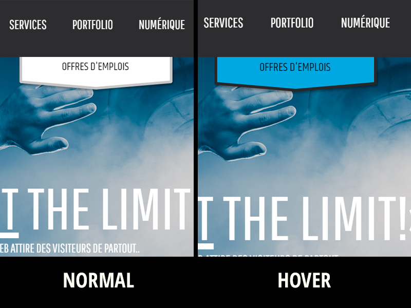
Examples of normal and hover states.
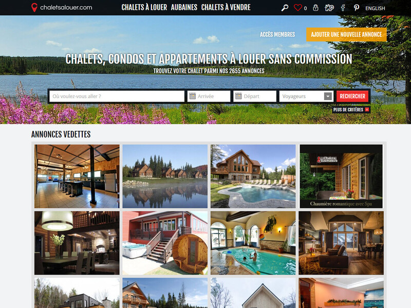
Sliding images.
Sliding images are really popular with our clients. They allow us to give a special look and feel as soon as the user enters our website. We've already talked about their disadvantages (you can read about it here), but there is a way to use them properly.

Solution :
If you have sliding images on your website, make sure whatever text you put on it is SHORT. Do not put an entire paragraph. Keep it simple and, if possible, insert a call-to-action button to help your users get to where they want to go.

It's also important you make sure your images scroll by themselves, without the user having to click on an arrow. That being said, you can allow them to manually change it if they want too, just make sure that, by default, it changes automatically after a couple of seconds.
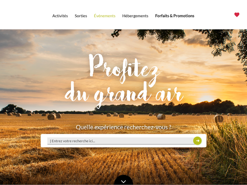
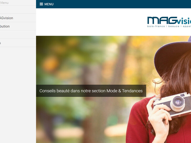
Another solution: More and more websites display a large image (called Hero Images) or video to greet their users. This image is similar to the sliding images, but there's only one. It's also used to give a special look and feel to your website as soon as we enter it.
Here, you can see the image was used behind our search engine. It gives it a great look, without the hiding essential information at first glance.
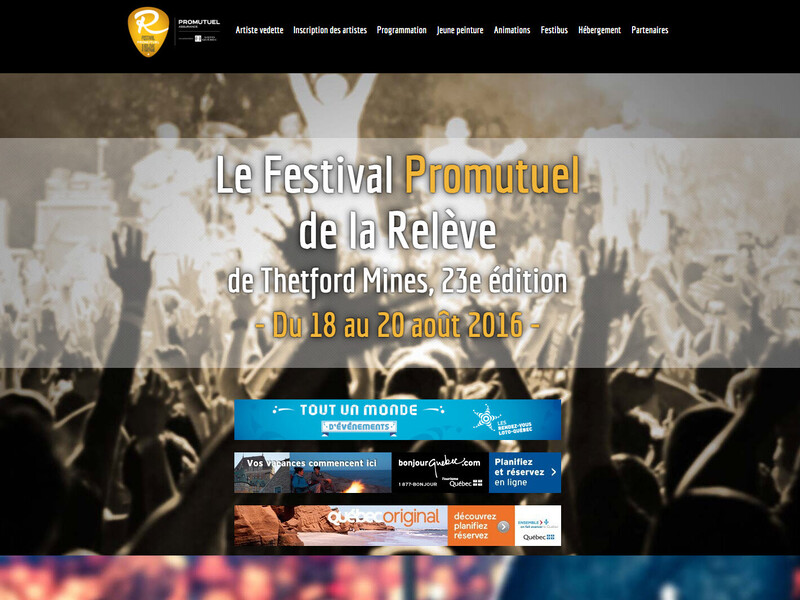
Here's another example of a Hero Image.
Another current trend: More and more, people display videos on their home page. They really capt the attention of your visitors and allow you to present more than one concept at the same time, or explain something in more details.
Animations?
You can present animations to your visitors, just make sure you use the right technology. If you still use Flash, that's a real problem because they CAN'T BE VIEWED on smartphones and tablets (who uses Flash today anyway?). Google might even penalize you if you do use it, so make sure you eliminate Flash from your vocabulary.
website have also used paralax designs in the last couple of years, although it's a little bit less used today. Paralax allowed visitors to get a really personnalized ambiance with a three dimensional effect.
Here's an example of a website using the paralax trend.
Here are a couple of websites that show what we mean by animations:
- More complex animations on various elements (view the X-Men's website)
- Mouseover animations (view Pharrel Williams' website)
- Special animations used to give a certain feel (view New Acton's website)
Solution:
HTML5 allows us to imitate lots of what Flash used to do, so use HTML5 animations ASAP!
Icons...
The look of your icons
Icons that 'look real', that glow or 'skeumorphism' aren't trendy nowadays. Use simple icons of a single color, without any shadow or other effects.

Here's an example of a skeumorphism design vs something new.
Solution:
More and more, we use simple icons that are easy for the user to understand.
The number of icons
LYou should restrict the number of icons you show, especially for your social networks. If you have a Pinterest account, but never publish anything on it, we'd recommend you not display it on your website. Make sure you use your social networks correctly before sending your visitors to them.

Icons as menus
They used to be trendy, and yes, we're still using them on our website today (but don't worry, we're actually working on changing them pretty soon!). We've noticed that they can be confusing for users, so if you want to continue using icons in your menus, just make sure you add some text to help the user know exactly what it means.

BOf course, there are some exceptions (for example, most social network icons don't require anything more because people already know who they are). Another exception is the 'Favorite' icon that is often represented by either a star or a heart, the shopping carton, or the lock to represent a login-type access. You get the picture!
Mega Menu
Another trend that started poping up is large menus that cover your entire website when you open it. Although it allows you to be a little more creative with your design, you should know that it isn't the most efficient way to present options to your visitor as it might distract him from his initial task.
Solution:
Instead, use menus that don't cover the entire website. It can be displayed on the side of your screen and take the entire height if you want to. Make sure it's simple and well structured. Your visitors will thank you!
Pixelated images...
Screens are getting bigger (and smaller!) and have increased in quality. One thing that's important is that you have to make sure every picture you display is of high quality!
Solution:
There are lots of good photographers out there, and most offer a fair price. Use a professional if you can! If you can't, you could always use image banks that give you access to thousands of pictures, but most of them are generic, therefore less personnalized for your business.
No matter what improvement you decide to do, it's always possible to increase the performance of your website. The more pro-active you are, the better your clients will respond.
Numérique.ca
418 335-0804
![]()
![]()
![]()